- Brandish
- Posts
- 🧠 This Tiny Checkout Mistake Is Killing Conversions
🧠 This Tiny Checkout Mistake Is Killing Conversions
Ankit Patel
October 15, 2024
Hey there,
Welcome back to the 63rd edition of Brandish,
Your guide to crafting an iconic brand.
Alright, let’s paint a picture.
Imagine your customer is ready to hit “buy.” Their cart is loaded with all the goodies.
You’ve done the hard work—attracting them, convincing them, building desire.
This is where the conversion magic should happen…
Right?...
But…
Instead of hitting “Complete Purchase”, they bounce.
Why?
Because your cart—AKA your conversion gatekeeper—felt more like a maze than a streamlined exit.
In today’s newsletter, we’ll discuss how you can quickly fix this problem to keep those conversions rolling in.
So kick back,
Grab your Brez,
And let’s break down why optimizing this final step in the cycle is just as important as everything that leads up to it.
The Biggest Checkout Design Mistakes
Let’s start with the basics.
Your checkout page should feel like the easiest, most natural step in the customer journey.
It’s the final destination. It should be simple, clear, and stress-free.
Instead, many brands turn this moment into a stress test.
Too many buttons, mismatched colors, endless upsell offers—it’s all too much. And customers are over it.
Here’s a little secret: simplicity wins.
But simplicity doesn’t mean boring.
It means organized.
Here’s an example from our cart 👇
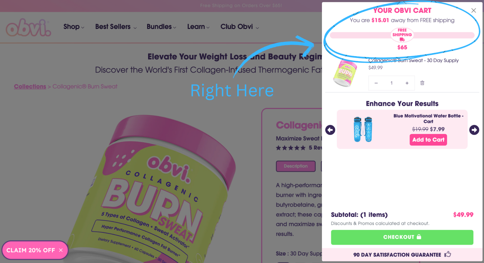
Notice the gift bar up top?
It’s dynamic and animates as customers add or remove items from their cart.
Spend $100? Here’s a free gift.
Spend $200? Here’s a bigger gift.
This interactive, visual engagement isn’t just for style points.
It nudges customers towards a higher cart total without them even realizing it.
A Clear Path to Conversion
One of the most common mistakes I see from brands—and something we’ve worked hard to avoid—is overloading the—is overloading the checkout with too much information.
Your cart page should feel like a direct highway to conversion, not a winding detour filled with distractions.
Customers don’t want to see mismatched fonts, pop-ups, or confusing upsells.
A cluttered, chaotic checkout creates doubt, and doubt leads to abandoned carts.
…Before we move on…
Let’s hit the pause button for a second and talk about something else that could be hurting your conversions.
Tool of the Week

When it comes to cart design and checkout optimization, everything boils down to lowering friction.
❌ Price anxiety? Friction.
❌ Trust issues? Friction.
❌ Confusion? Friction.
Every bit of friction hurts conversion rates and costs you💲
Some friction you’re probably not thinking about right now? Address verification.
“But I have Shopify autocomplete.”
Sure, but that’s ONLY a recommendation. It doesn’t nail down the customer’s contact details, it just lets them pick something that looks right.
Even if it’s wrong or missing an apt # (!)
And they can still enter a PO Box if they want.
Even if you don’t ship to PO Boxes.
❌ Wrong customer address? Friction.
❌ Package re-ships or re-routes? Friction.
❌ Delayed arrival or lost package? Friction.
And this friction hurts your profit in all sorts of other ways too. Double shipping costs, carrier fees, surcharges, customer frustration, customer service tickets, etc.
That’s why shipping errors and additional expenses cost high-volume brands $10,000 (or more).
Every. Single. Month. 😬
Address Guard’s global address verification and intelligent rules engine solves all of these problems for brands.
✅ Reduce checkout confusion with auto-verified contact details.
✅ Limit the number of re-ships, re-routes, and lost packages.
✅ Eliminate secret added fees and costs from carriers.
All for just pennies per order.
There’s never been a better time to lower your shipping friction.
Black Friday is coming. Get protected before your orders (and wrong addresses) surge. Don’t get caught paying for other people’s mistakes.
Click here to get FREE address verification from now until November 15th and find out how Address Guard can improve your bottom line.
Now, time to get back on track…
The Mobile-First Rule: Why Cart Design Should Prioritize Thumbs Over Mice
Most DTC brands are still prioritizing desktop design over mobile.
That’s a huge mistake.
With up to 90% of traffic often coming from mobile devices, making sure your checkout experience is optimized for smaller screens is crucial.
Mobile users expect a seamless, intuitive process.
If your cart is difficult to navigate, requires excessive zooming, or is cluttered with unnecessary elements, it creates friction.
And in a world where customers expect everything instantly, even minor frustrations can lead to abandoned carts.
A well-optimized mobile checkout should be user-friendly.
This means larger, easy-to-tap buttons, a simple and clear layout, and minimal steps to complete the purchase.
We learned early on that designing with mobile in mind wasn’t optional—it was essential.
We streamlined our cart to make it user-friendly on all devices, ensuring that every interaction was smooth and efficient, especially for customers using mobile.
In today’s market, focusing on mobile-first design is no longer a choice—it’s a necessity.
It’s about reducing barriers, eliminating friction, and making the purchase process as straightforward as possible for the customer.
Smart Upsells
Lastly, I want to talk about upsells.
When done wrong, they can come off really pushy.
But when approached thoughtfully, they feel like a friendly suggestion from someone who genuinely wants to help.
Take a look at Obvi’s checkout page.
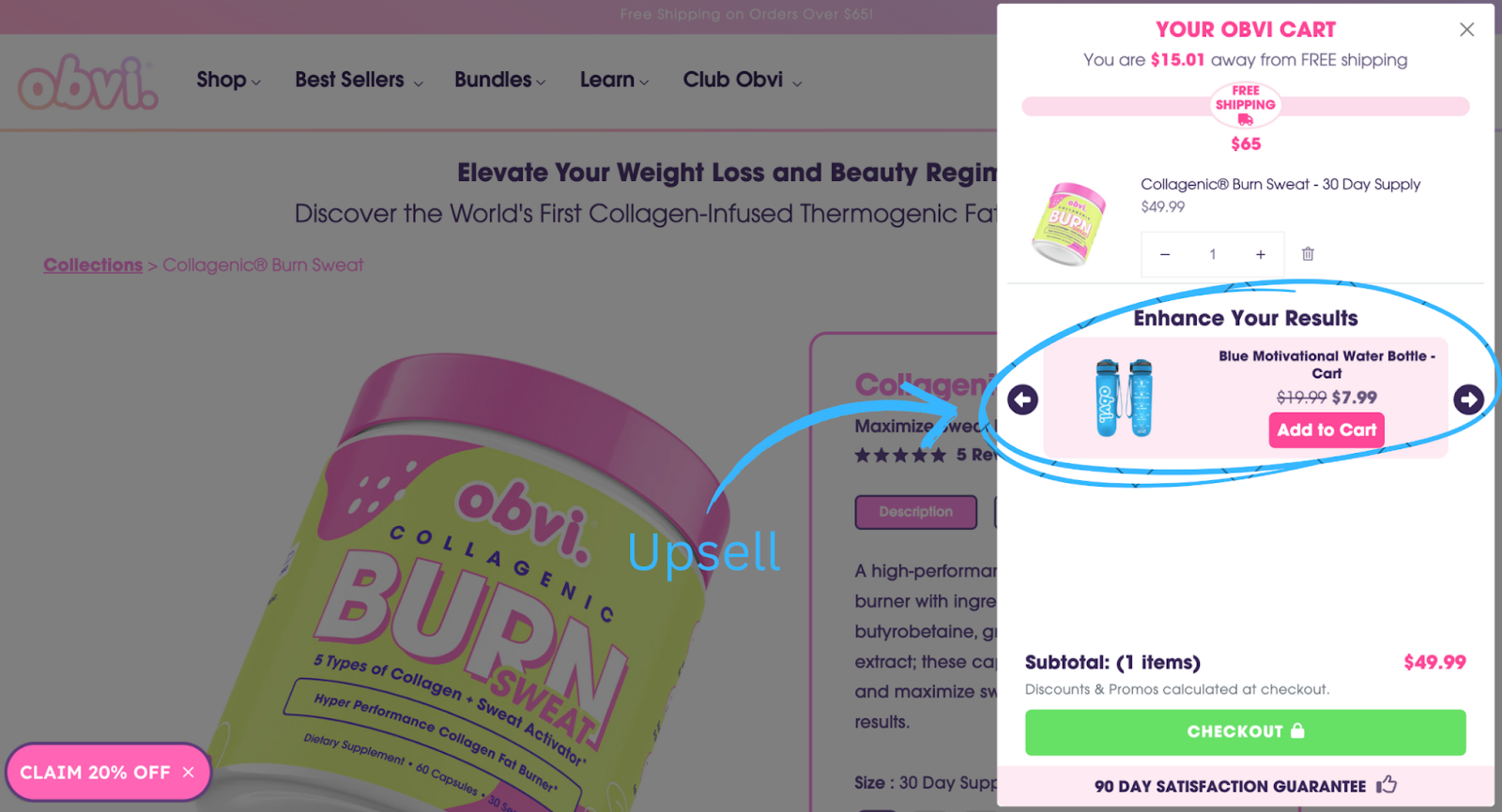
Instead of bombarding them with additional products, we keep it simple by placing our upsell offers at the bottom of the cart.
This way, customers see a related product at a discount without feeling overwhelmed.
The key is to add value rather than push for more sales.
The best upsells feel like a casual “you might like this,” not a loud “BUY NOW!”
Wrapping Up
Remember.
Optimizing your checkout process is essential for converting potential sales into revenue.
A streamlined, intuitive cart design not only enhances the customer experience but also reduces the chances of cart abandonment.
By streamlining this final step, especially for mobile users, you’re not just removing obstacles.
You’re creating a smoother, more enjoyable experience that encourages your customers to hit that “buy” button.
Just a few tweaks can lead to a significant rise in conversion rates.
That’s all I have today!
Thanks for reading!
And until next time,
Ankit